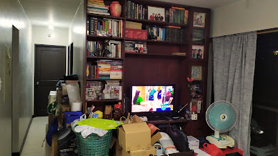
The "classic" look of our living room looked dated after a decade. It also made our living area smaller. We were told several times that we should have gone for lighter colors to make our space look bigger. The open shelves also made things look very cluttered. Through the years we also kept adding stuff to it. Never really had time to declutter.
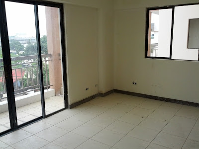
For our living room, our main objective was to make the space look bigger and clean. We felt our unit breathed a sigh of relief when we emptied it (haha). It really needed a good clean-up. Here's how it looked before we moved in -
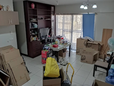
How it looked before we moved out (didn't really occur to us to take photos of the cabinet in the past 10 years haha) -
We originally put the loveseat sofa beside the dining table. We copied that from Tita Pet and Uncle Fumio in their home in Tokyo. It saved a lot of space, but it wasn't really good for my back. It would have worked if it was on a platform.
 |
| There's a loveseat sofa somewhere there. |
How the cabinet looked when it was empty -
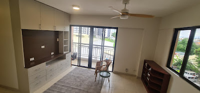
Here's what we changed:
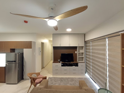
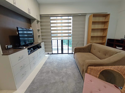
Floor to ceiling living room cabinet was overhauled. Added cabinet doors to the top portion. Kept the drawers but changed the handles. Removed the glass cabinet and repainted to a lighter color. TV area also made bigger to accommodate a larger TV.
Removed the metal shelf and re-used a Billy bookcase (those are really sturdy!).
Replaced the lighting fixtures to nicer ones.
Replaced the chandelier with a fan. It gets warm in the afternoons and the fan has changed the overall temperature a lot.
Moved the loveseat sofa in front of the TV area, added a rug, an armchair and a side table.
Removed the double curtains and switched to blinds. The blinds actually ward off heat and the sun better than curtains.
 |
| Work in progress. |
 |
| Almost there. |
 |
| The fan and the finished cabinet + blinds. |
 |
| The new living room. |
#BeKind #StaySafe


No comments:
Post a Comment