I must admit, I'm not the best when it comes to design. I was stumped when Architect Wansi asked if we had an idea on what we wanted. Our response was a big, "Errrr". I turned to a friend for help and she gave me several ideas on where to get inspiration. Here's a list of what we looked at (it's also what I use when I look for inspiration for my quilt projects) -
1. Pinterest
I've been using Pinterest mainly for my craft projects. I was surprised to see a lot of home related pins too. Checked general pins first and then funneled it down to what interested us.
2. Instagram
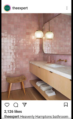
When I started searching for home designs on Pinterest, of course, Instagram started showing stores selling furniture and furnishings. That's how I discovered limewash paint and turf grass.
 |
| Super cute girly bathroom for my craft room. |
3. Netflix
Yup, there are a lot of shows you can watch on Netflix about home design/renovation/decluttering. There's Dream Home Makeover and Home Edit. We also like watching Tiny House Nation. Watched a few Marie Kondo episodes, but I'm not really fond of reading subtitles while watching (except for CLOY, lol).
4. YouTube
There's a gazillion home renovations vids on YouTube. We used it mainly to understand what goes in your house since we're first time house owners. We usually watch Architect Oliver Austria, Architect Ed, Slater Young and we got ideas also from Mikey Bustos. There are a lot of local houses/rest houses featured on OG and Presello. We also watch foreign ones to understand concepts. That really helped us communicate better with Architect Wansi.
5. Vacation photos and former homes we stayed at
Yes, vacation photos. We take photos of places we really like. Our bedroom's new look was inspired from our last vacation in Bohol. I think everyone can agree that your home should address your functional needs and make you feel good and happy.
 |
| Old Fairmont Hotel in SG (c2015). The room was huge! |
And, of course, there's Google for all the other questions you may have. We gathered up all our "wants" and collated it in a Google Photos album. It served as our peg board.
We eventually ended up planning our rooms based on our needs. We went for a general "modern tropical home" look. We assigned our living room and dining room to be our "grown up" room. Colors are neutral, making it look light and airy. Decided on a classic kitchen look since my aim is to make it look uncluttered. This spilled over to the dirty kitchen now baking kitchen. The basement is where we hang out a lot, so we thought it should show our personalities more. In general though, save for Miggy's bedroom, we stuck to neutrals. We though we could just change accents whenever we feel like it.
#BeKind #StaySafe


No comments:
Post a Comment